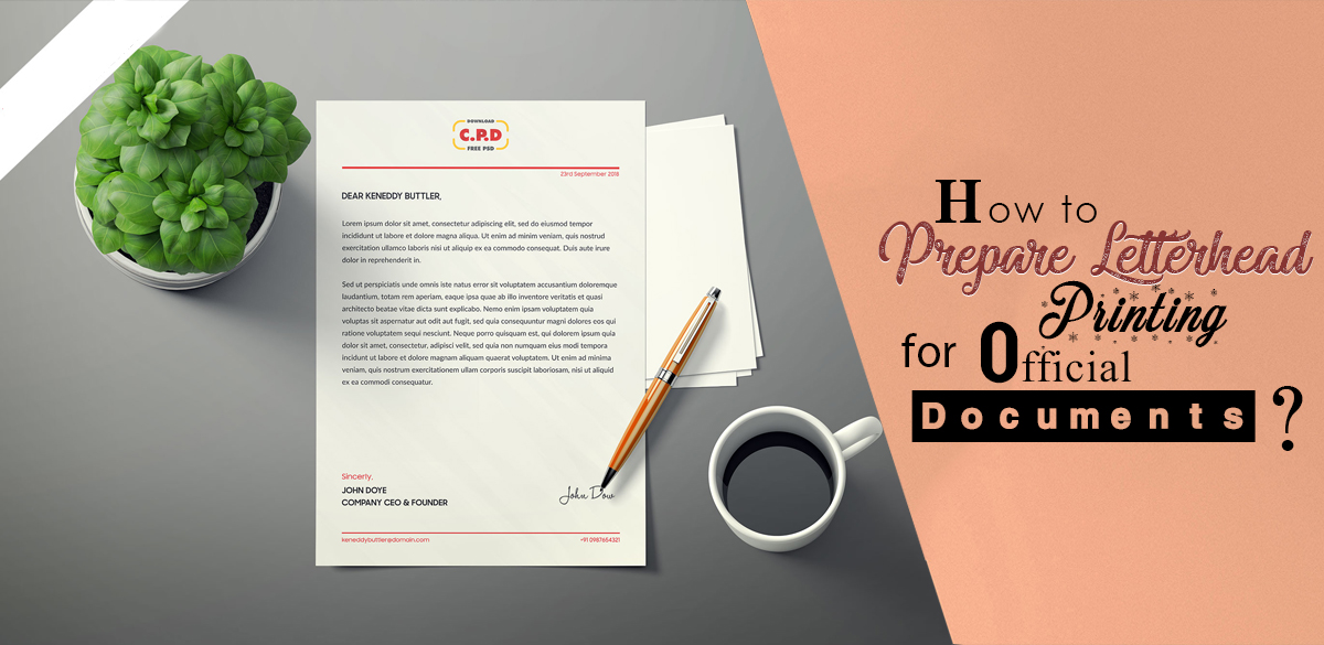
Letters have been exchanged for centuries. They have been the primary source of correspondence between two or more parties. Official correspondence has always involved letters. Although today the internet and mobile phones have taken over personal communication, letters are still used for conveying messages officially.
Companies use letters to communicate with other companies, their clients, and customers. Letters have always been seen as the credible way of correspondence bringing an official touch.
Companies do not just write a plain letter. The letter they use is a special type called a letterhead. It is a special kind of letter that has two sections. The upper section is smaller which is called a head or a letterhead. And the lower part is usually referred to as the body.
A letterhead has a company’s information such as its name, logo, contact information, and any other relevant, important details. It brings a lot to the table. Companies can customize their letterheads and make them more effective at persuading clients.
Their letterheads can be a source of credibility and promotion at the same time. Letterhead printing needs some planning. You must have sorted out everything before you set out to print one, or many. There are some crucial elements that need to be discussed here.
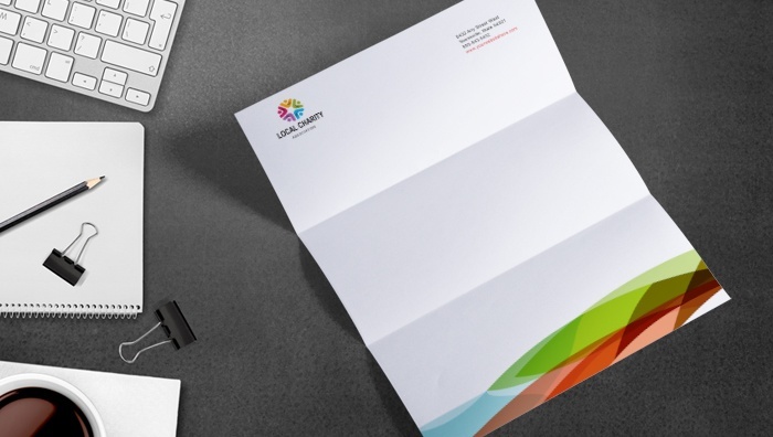
Secure the Base:
You need to have a proper plan that you must follow. Otherwise, you might end up throwing everything randomly at your letterhead and mess it up. A blank page just does not look right o you might be tempted to fill it up quickly. But what is it that you have to write? And what is it that you do not? Not writing something on letterhead is as important as writing something.
Do not go for a simple Letterhead Maker such as Word or Pages. They are satisfactory for simpler layouts but do not work well when you want to go fancy and create elegant designs.
Choose software that is adept at intricate graphics such as Adobe. It will help you a lot in the designing department and will guide you through the process. If you want to use Photoshop, your settings must be at 300DPI so that the document comes out clear instead of being blurred.
Select the size you want for the letterhead and then stick to it. In most countries, the standard size is A4 so it is a better option to go for. Observe other letterheads and decide on a layout for yours. A lot of people ignore the layout step and regret it later. You can avoid that by setting put a clear plan for your layout. It need not be fancy. You can go simple.
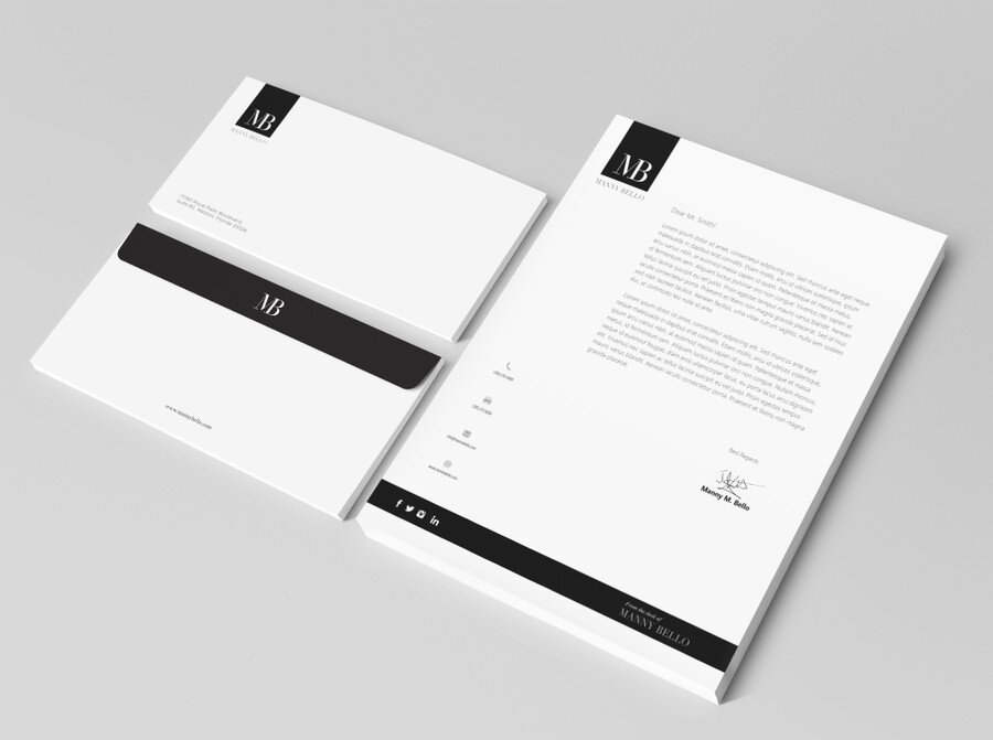
Border It:
In a custom Letterhead, a border is used for drawing attention to the content. So, it is a gateway to the center where you want people’s attention focused. It is alike attracting people towards the painting through its frame.
There is no restriction on going monochromatic. You can choose multiple colors at one time. But the point remains: do not make the border too distracting for the reader as it might draw their attention away from the actual content you want them to read.
You can add graphics. For instance, if you are a company dealing with natural products, you can border your letterhead with greenery.
Geometry:
If you are a tech company, take inspiration from apps and introduce geometric designs in your letterhead for the company. It gives a stylish look to it. It is a modern trend and is based on creating symmetrical shapes. These shapes could be repeated to create a 3D pattern.
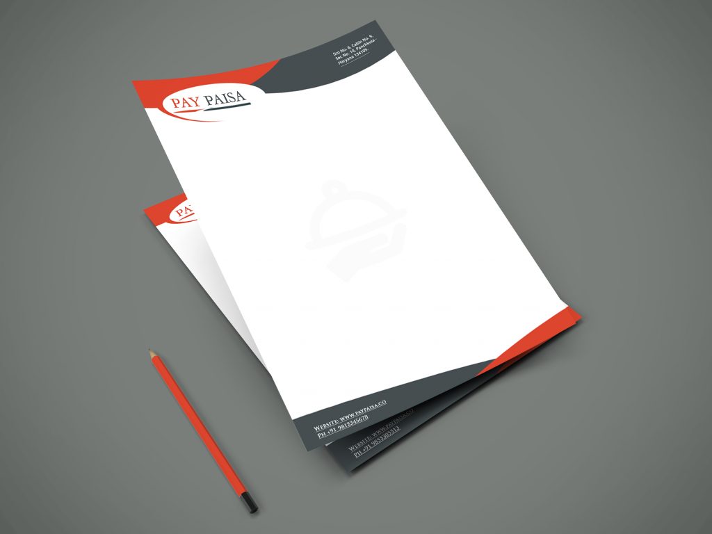
Consider the Audience:
While going through designing, always keep your audience preferences in your mind. You might always need small tweaks to fit into the framework that your clients demand. For instance, if you are targeting youth, minimalistic designs will be of little help.
On the other side, if you are running a legal company, minimalism will surely help you. So all of this depends on who your target is. Move according to that.
The Logo:
The clients must know that you are working seriously and putting a lot of effort into your business Letterhead. But they should also know who you exactly are and should remember you for the coming times. There is no better way to etch yourself in the memories of your clients than to print a logo on your letterhead.
A logo is a condensed form of your whole branding. It is the essence of what you are. So you will have to create a logo that does this job effectively. The most efficient way of doing is to use the initials of your name and turn them into an attractive symbol or the like.
You can choose creative fonts for that to distinguish yourself from other brands and impress your clients. The color of the logo is as important as the font. For example, yellow and grey always represent a corporation. You can try other combinations too.
Use colors freely:
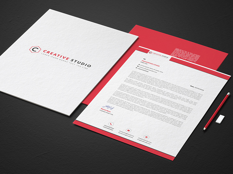
Trying to look too professional might cost you. Do not be afraid of using colors. Humans have the tendency to see the colors and make assumptions. When the recipient takes your letter out from the envelope, the first seen is the color of your letterhead. Go for basic colors to lift up the mood of your client.
Do not clog:
Inundating the letterhead with uses details is a losing strategy. It is costly and makes your letter unattractive. Make sure you are only writing important details. These include the name, contact number, address, and other such information.
Letterheads Printing is a great way of representing your brand. They act as communicators and can have a lasting impact on the one reading them. So make sure you are printing them by following helpful guidelines and making your creativity do the work.


