User experience is a primary consideration for any web design company while designing an e-commerce store. Magento e-commerce has a very powerful operating system that keeps the website functioning efficiently.
However, as an e-commerce business having bounce rates and lower conversions is never a good sign. This means that your customers aren’t happy using your website. A poor navigation interface is a significant turn-off for the users. In that case, no matter how great your products are, chances are you will never even get the opportunity to show them.

It is crucial to make your website user-friendly as much as possible. You need to keep your website simple, easy to navigate, and responsive. Some tips that will help you achieve your goal:
Go for a simple design
The first impression always counts. And the first impression of your websites is home pages and landing pages. The main goal of your online store’s usability is to give your audience an effortless user experience. Make sure that your Magento web design is appealing to your customers. You want users to stay on your website, browse your products, and place orders, right? So, start working on the design from the very beginning.
Create a checklist of elements
Every website is different. So, make a checklist of items you want on the website. Few things like shopping cart, call-to-action-buttons, payment options, voice search are pretty common these days. So be sure of what you want and then implement them on the website. Make it as interactive as possible.
Personalization is the key
Another way to make sure you appeal to your target customers is by personalization. Magento is an open-source platform. So, it offers extensive customization options and advanced functions for your website. One easy way to customize your website is by choosing a theme.
There are multiple free and paid options on the platform to select themes. You can then start integrating elements, color palettes, fonts, graphics, logos according to your business module.
Interactive elements in your website
Shopping carts that show the total amount, approximate delivery date, wish list pages, and confirmation pages, new arrivals can be ways to attract more customers.
Every visitor doesn’t need to buy products right away. Make a place for them to store their favorite products. Also, it is advisable to keep the confirmation pages clean without cluttering with other related products.
Auditing usability to detect flaws
Once you have designed the web pages, run the site through Magento UX Audit. This helps to give a detailed analysis of the website to detect any flaws.
The main goal of the Magento audit is to give an idea of the obstacles the website can face to realize the full potential of the e-commerce store.
The good thing about Magento audit is that it tends to go through microanalysis and web store analysis. This analysis often gets ignored but has a huge contribution is the store’s success.
Making suggested changes
With the help of the audit, you will get recommendations on how to make the design much better. If there are too many unresolved issues, it is better to start from scratch. But incremental redesign strategy minimizes the risk and maximizes the ROI.
For instance, say one recommendation is to remove the carousel way of showing products. Most businesses will copy a layout from a more successful brand and use it. The right way is to implement the data to understand customer behavior and find an alternative way to optimize your webstore.
A/B testing is a necessity
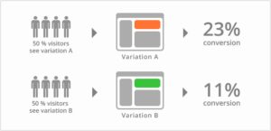
By this stage, you have collected enough data to set conversion goals. But to ensure that the new design will perform better than the current one, do a split test. This is the manageable yet most effective method of understanding what’s working and what’s not. Once you find out which one works the best of the two, that’s your final version!

Optimizing the images
Images are a very important part of an e-commerce website. The customer needs to see an item properly before placing an order. As there isn’t any trial option like a brick-and-mortar store, images are the anchor. So, optimize your images for a smooth performance. Make sure the images aren’t too heavy.
Hopefully, these strategies will help you to get a successful e-commerce store design. If you are looking for a website development company for your Magento e-commerce store, contact KOL Limited.


